The case for fewer colors
Every new brand wants a palette of twelve. The strongest identities we have built use two and a half.

Theo Marsh
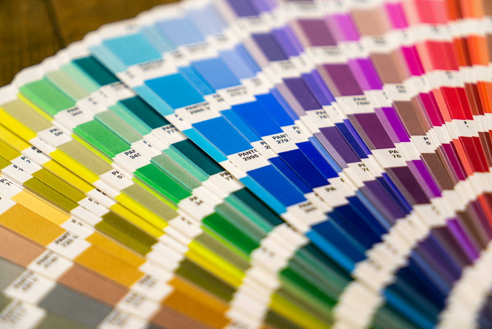
Open any brand guideline from the last five years and you will find a page of swatches that looks like a paint shop. Primary, secondary, tertiary, tints, shades. Then look at how the brand actually shows up: two colors, used inconsistently.
Constraint is recognition
People remember brands by color long before they can read the name. That memory needs repetition, and repetition needs restraint. Our own identity uses bone, ink and a single vermilion — and the vermilion is never allowed to be small text.
“If a color needs a rule to explain when to use it, it probably should not be in the palette.”
A simple test
Print your homepage in grayscale. Is the hierarchy still clear?
Cover the logo. Can you still tell whose page it is?
Count how many colors appear above the fold. More than three is a warning sign.
Fewer colors do not make a brand boring. They make every color you keep louder.
Written by
Theo Marsh
Design Director
Theo leads the identity team and keeps a running list of the world’s best supermarket signage. He believes every system needs one rule worth breaking.
(Next) — Keep reading


